

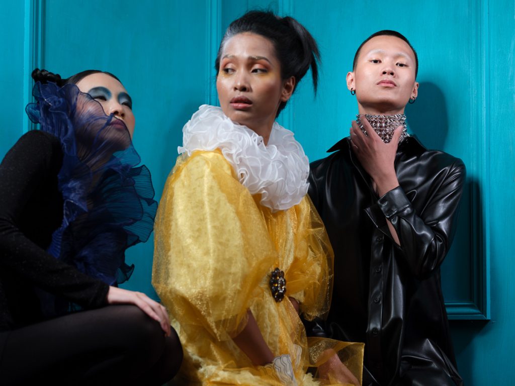
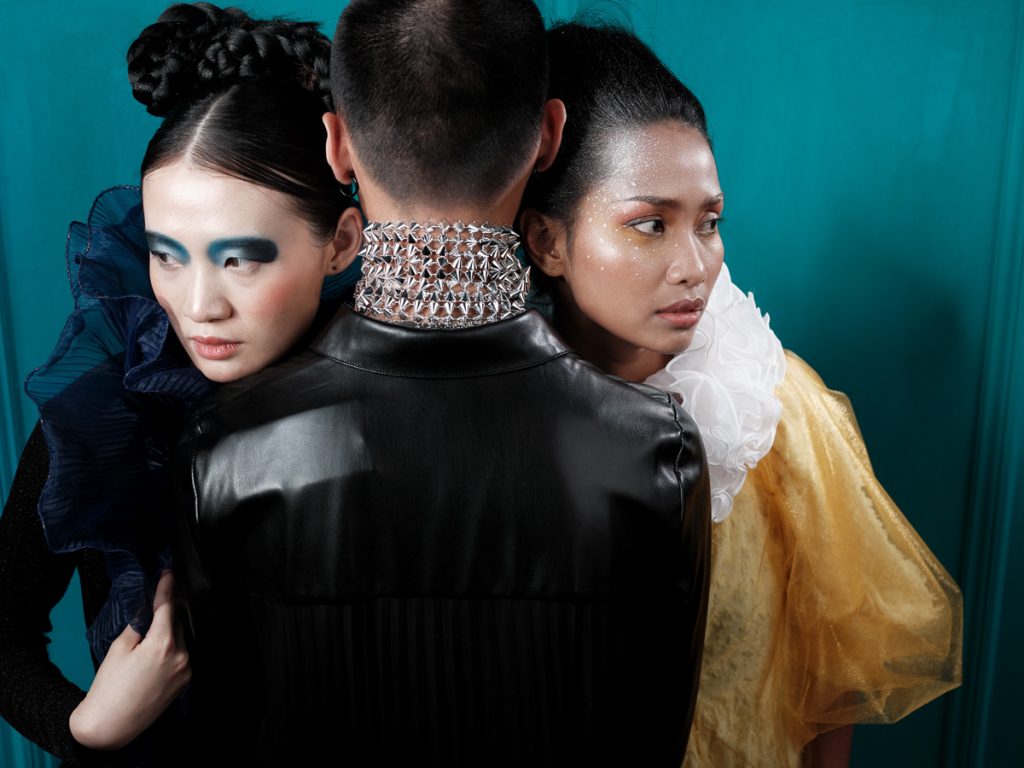
The turquoise set Design
When I was looking for a new set design, I wanted to have something, which could represent a corner of a room. I did not just want to have two walls to show, but also some structure and shadows. So I added frames to the walls and then painted everything – in turquoise. It spontaneously came to my mind, that turquoise is the right color. However, I also bought pink and yellow. Although I even needed to mix the turquoise myself because the shop only offered light blue and light green, I still felt, this would be the right color.
I have no deeper relationship with that color, but somehow, I found it really attractive. So I wanted to learn more about it.
It is said, turquoise balances emotions, creates stability and represents a happy color for people, enjoying their lives. Ah, that is interesting, and in my case also quite true! So maybe from now on, this is my favorite color!
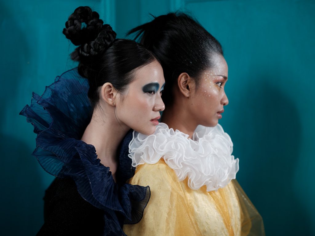
We tried the set first with some darker and also some yellow garments. And I think it looks quite good together with black, blue and yellow.
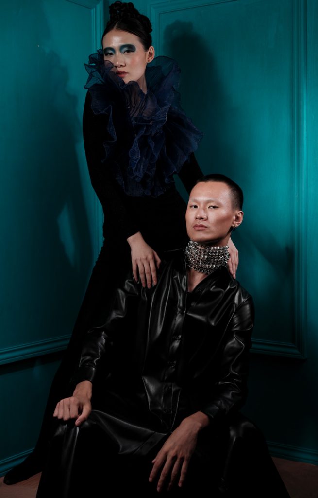
Thanks to Margerie, Annie and Jhin, we got some nice creations together – and I have got a new favorite color!
Models: Margerie, Annie and Jhin (@qianbo_jin)
Hair and make-up done by @Firdonyoiki, dress, styling and photography by Alex.


