Postprocessing
In the old days we handled film carefully to avoid collecting dust, because it was an elaborate process to remove the white dots on the final print by rendering in water color. We could burn or dodge parts of the print also but not in a reproducible manor and not well controlled. Adjusting contrast by choosing the right paper type was yet the easiest of all that post processing work. But it was fun too and I remember that there was always some kind of this work to be done with every print, which came out of the dark room.
Today everything is easy. You could even pre-select motive programs on your camera, doing some of that image processing choice for you automatically. But still, depending on the situation, many times a picture does not come out of the camera as you wanted it. Also sometimes the idea of the image, you have in mind cannot be created by the camera alone. Post processing is necessary. And there is an overwhelming support for all kinds of adjustments and enhancements by various available tools.
But how much of post processing is good?
I actually do have an answer, at least for my own workflow. It starts with the intention of the photo project, I am working on. Every project has a message or idea, which requires the images supporting this message. So I use camera equipment, lenses, location, lighting conditions and so on to get the images as close as possible matching with the desired result. This also then applies to every single image. Post processing is time consuming. So we should make very conscious decisions about what we are doing with the image after it comes out of the camera. Enabling large scale of manipulation requires RAW file type. So I always shoot RAW in addition to jpeg.
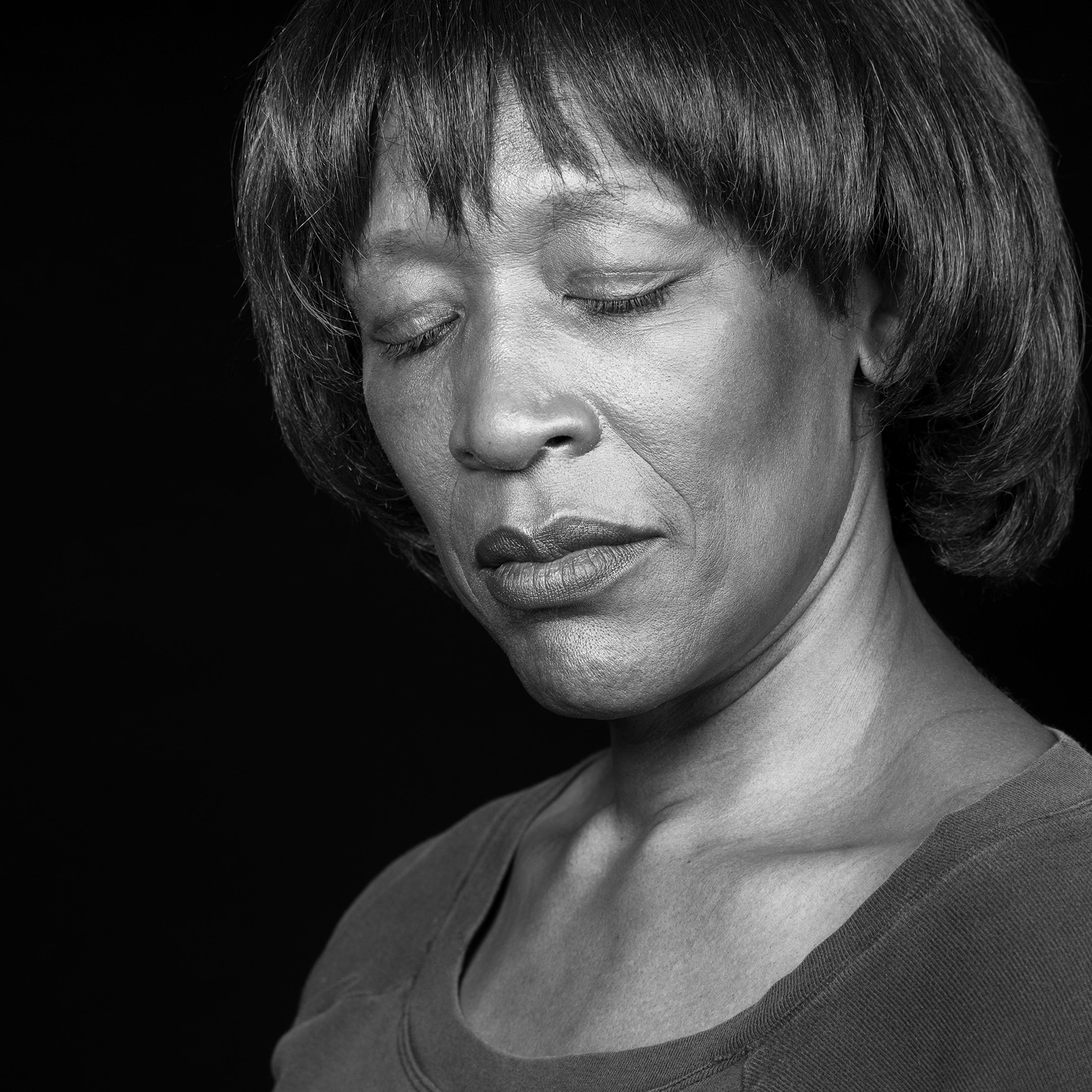
In my workflow one of the first steps is to focus on all items, which distract the viewer’s attention from the desired message. Unfortunately our brain is trained to focus on the abnormal, the one incident versus the overall. So a single hair in a face or a certain skin irregularity will draw the viewer’s attention away from a holistic impression of a persons face. Sometimes this can be desired, but if not, it should be removed. In a second step I will enhance the image using those measures and tools, which support the message of the image. This can be contrast, saturation, color enhancement and filters and a lot more. I know that many photographers do it the other way around. This is a matter of personal preferences.


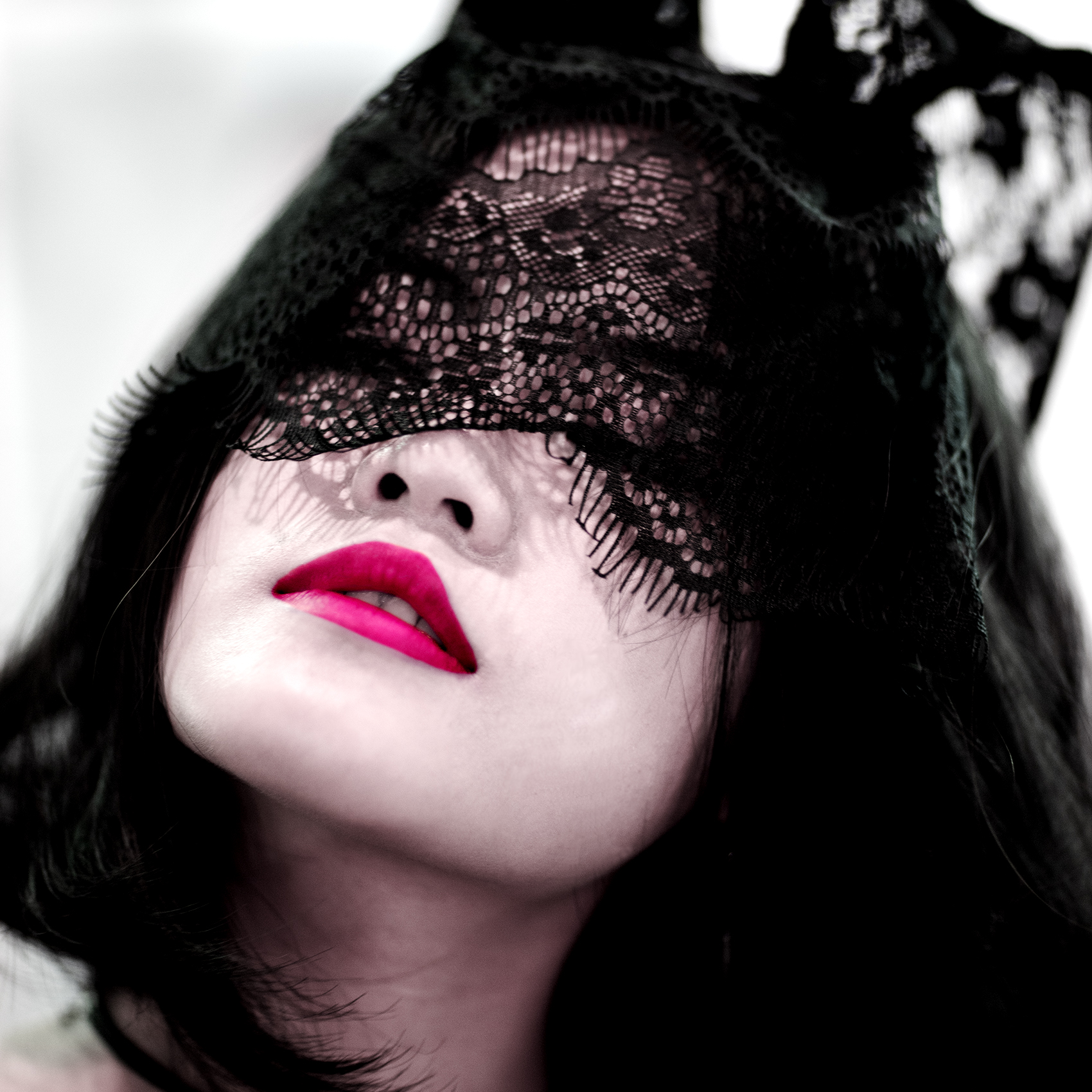
I met Freda on a Tattoo-Show and asked her if I could take a photo of her. She was one of the contestants for a tattoo competition and approached by many photographers. She started posing like a professional model when I raised the camera. With the laced mask, she was wearing, and the seductive posing, I already made up my mind, how I wanted the images to look like.
I wanted the saturation of the image very much reduced, but not as far as just showing black and white. Then showing the lips with a very colorful pink. I do not like those images, you find now and then, which put colored items within a true black and white environment. They look too artificial. Furthermore I did a tonal correction on both the black and the white end. Before I did the above, I also cleaned the image from all distracting elements and cropped it to a square format.